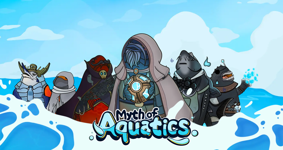
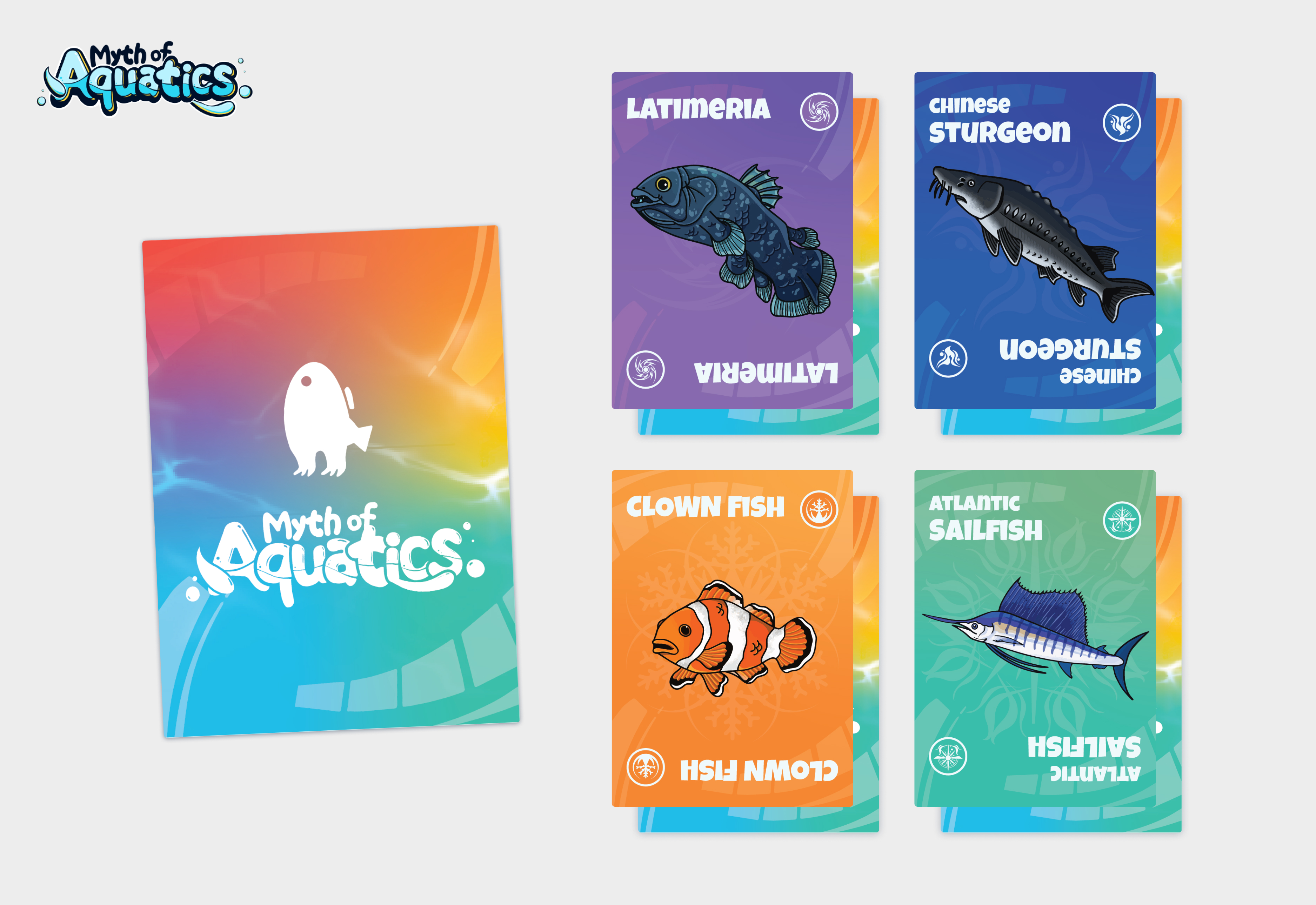
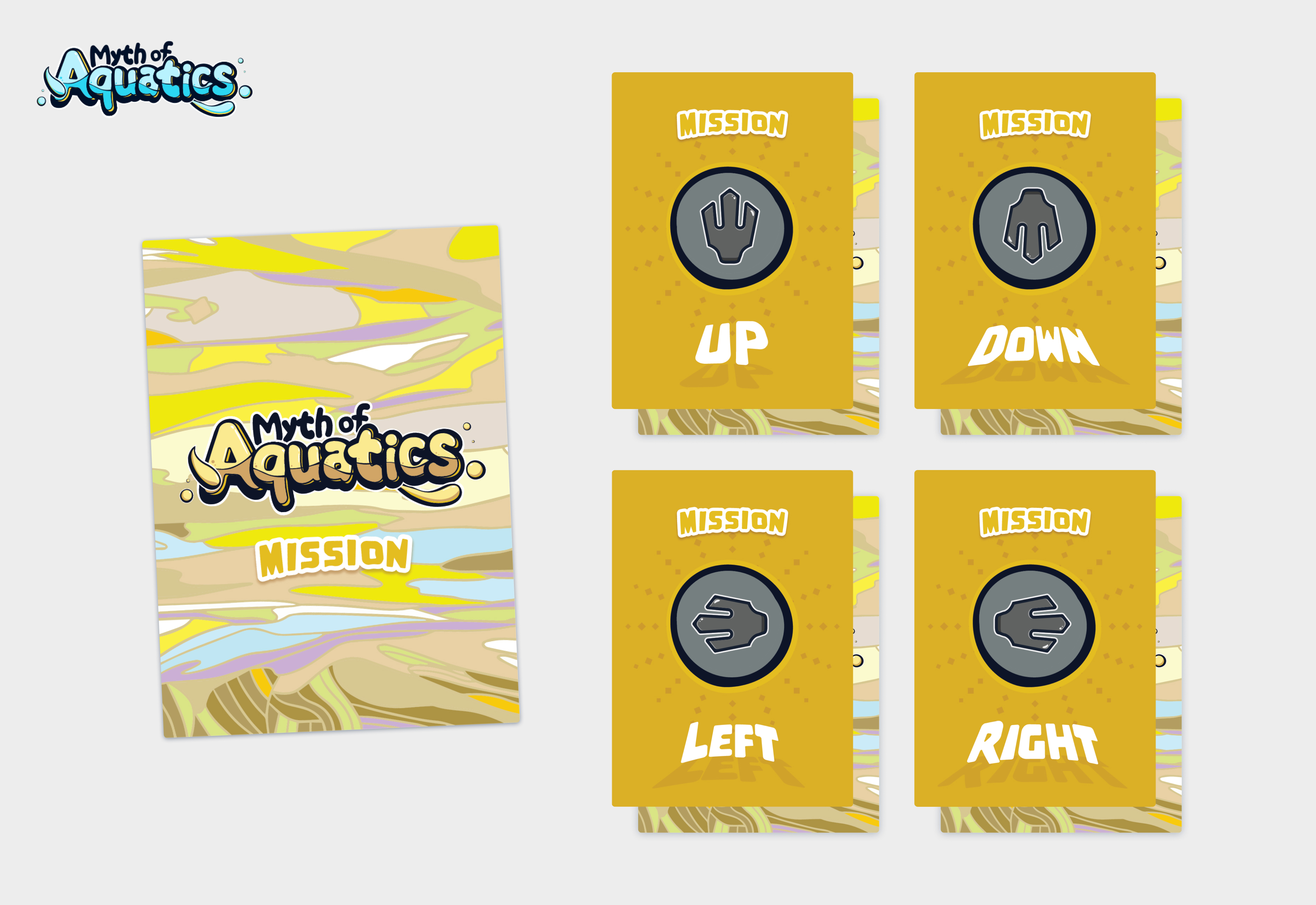
As MOA's target audience is children, the logo needed to be clean, easy to understand, and immediately convey the message with a single look.
I used "Myth of Aquatics" as the logo to ensure brand recognition.
Using water flow as the central concept, the logo features bubbles and water inside and outside the wordings.
To make it more engaging for kids, we played with the font to make it more fun and visually appealing.
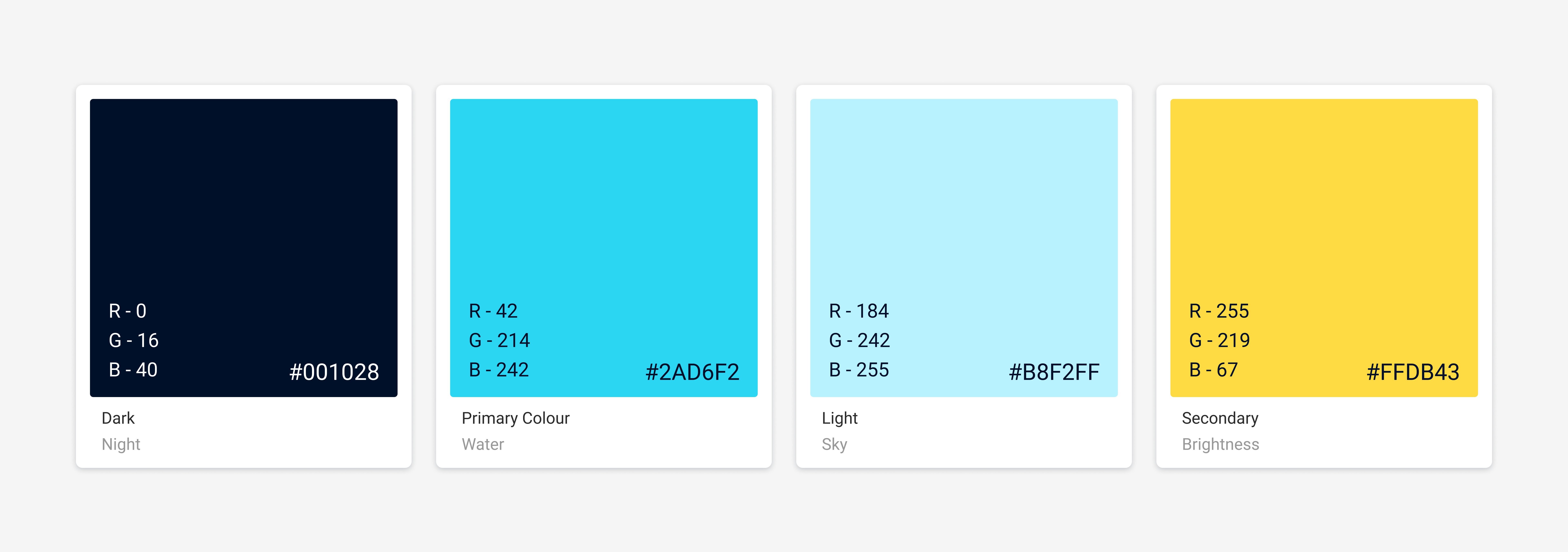
The high-contrast blue and yellow color scheme was chosen to create a fun and kid-friendly brand while evoking the feeling of being underwater.