Back Button
On Board
In 2023, many of my friends wanted to try skateboarding, and I realized how confusing it was, even after watching countless videos, I still struggled to choose the right board online.
This inspired me to explore how skateboard sellers could better support beginners.

The project addresses the problem of beginners struggling with online skateboard purchases due to limited knowledge and overwhelming options.
The solution guides users through customization via a questionnaire and highlights user reviews and ratings.
Timeline
September, 2023
Team
Individual Project
Role
UX, Visual, Interaction Designer
Tools
Figma, Adobe Illustrator
Problem Discovery
What challenges do beginners face when buying skateboards online?
Do beginners consider any factors despite their lack of experience?
To understand their decision-making, I conducted informal interviews with friends interested in skateboarding. I asked them to browse online shops and share their thoughts, revealing key concerns and confusion during the selection process.
icon-texture

Graphics

Users tend to prioritize images when they enter the website.

icon-texture

Price

Users pick budget options without knowing if they meet their needs.

icon-texture

Reviews

Users often rely on ratings, reviews, and recommendations from others.

But what should beginners actually consider when buying a skateboard?
With little prior knowledge, I dove into research — watching 15+ YouTube channels, joining 10+ skateboarding communities across Reddit, Discord, and Facebook, and reading countless expert articles to understand what truly matters.
icon-texture

Functionality

Key specs like deck size, wheel softness, and truck width affect comfort and performance. Softer wheels improve comfort but reduce slide control; wider decks offer stability but slow down flips.

icon-texture

Material

Deck materials, such as 5-ply Maple or Quad X layers, influence weight and durability. Brands like Santa Cruz and Creature push innovation with thinner, stronger boards.

icon-texture

Graphics

Designs and colors reflect personal style. For many beginners, eye-catching graphics are a top priority and help spark excitement for skateboarding.

What strengths can we learn from?
icon-texture

Efficient Filtering

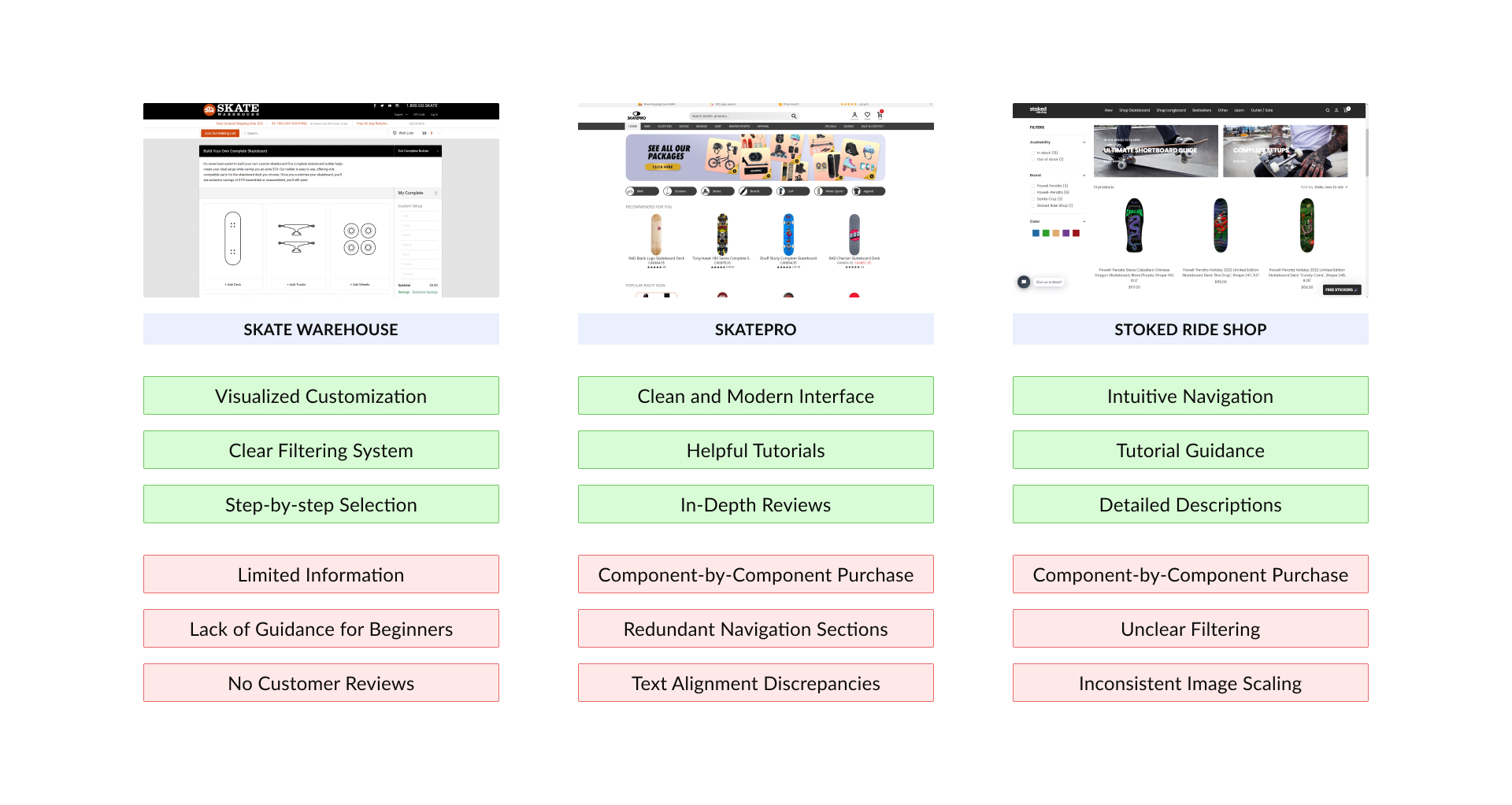
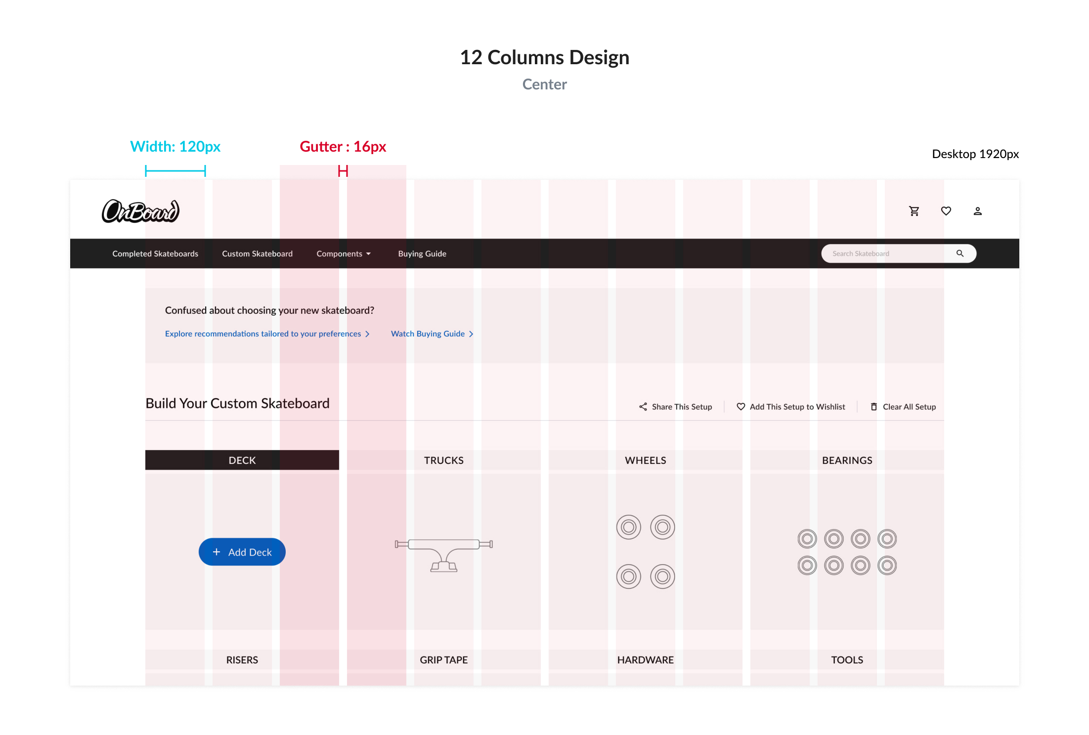
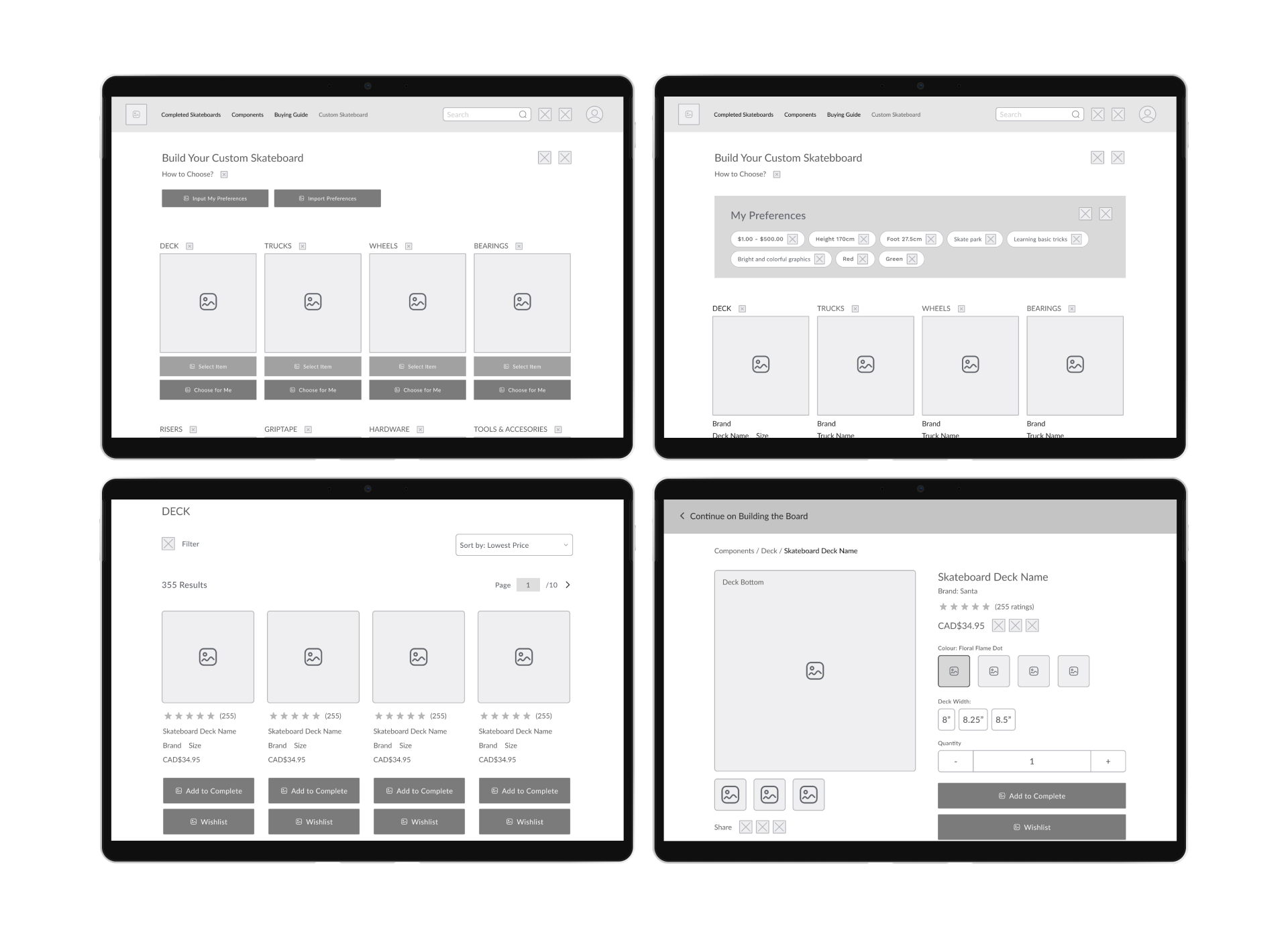
User-friendly filters let shoppers narrow choices by brand, color, or size.

icon-texture

Visual Appeal

Grid layouts with bold images make it easy to pick colors and styles.

And what problems or weaknesses should we highlight?
icon-texture

Lack of Guidance

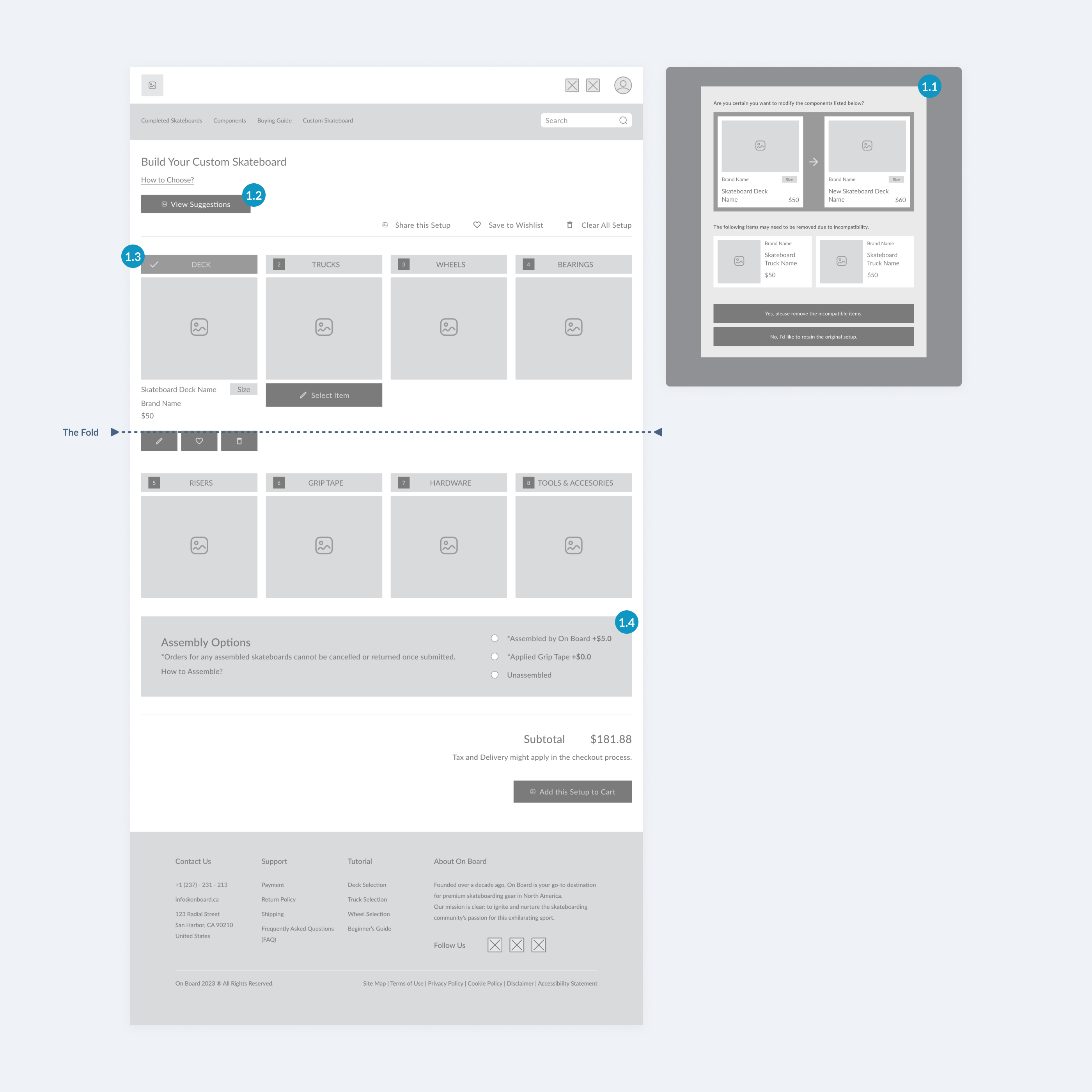
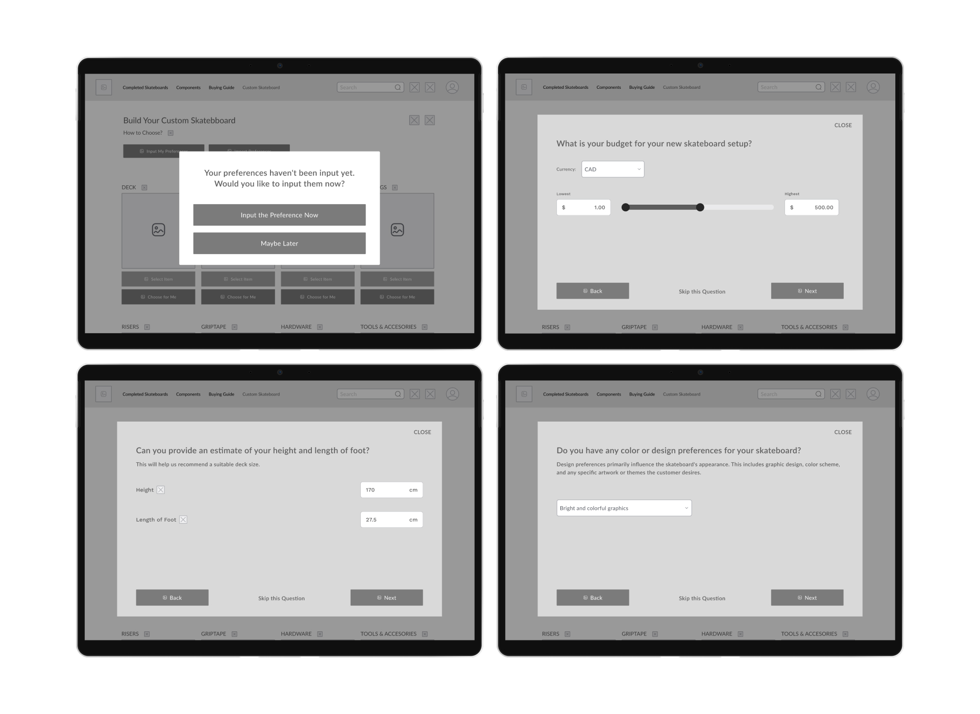
Despite some tutorials, beginners often feel lost due to technical jargon and lack of clear part-pairing suggestions.

icon-texture

Tedious Selection

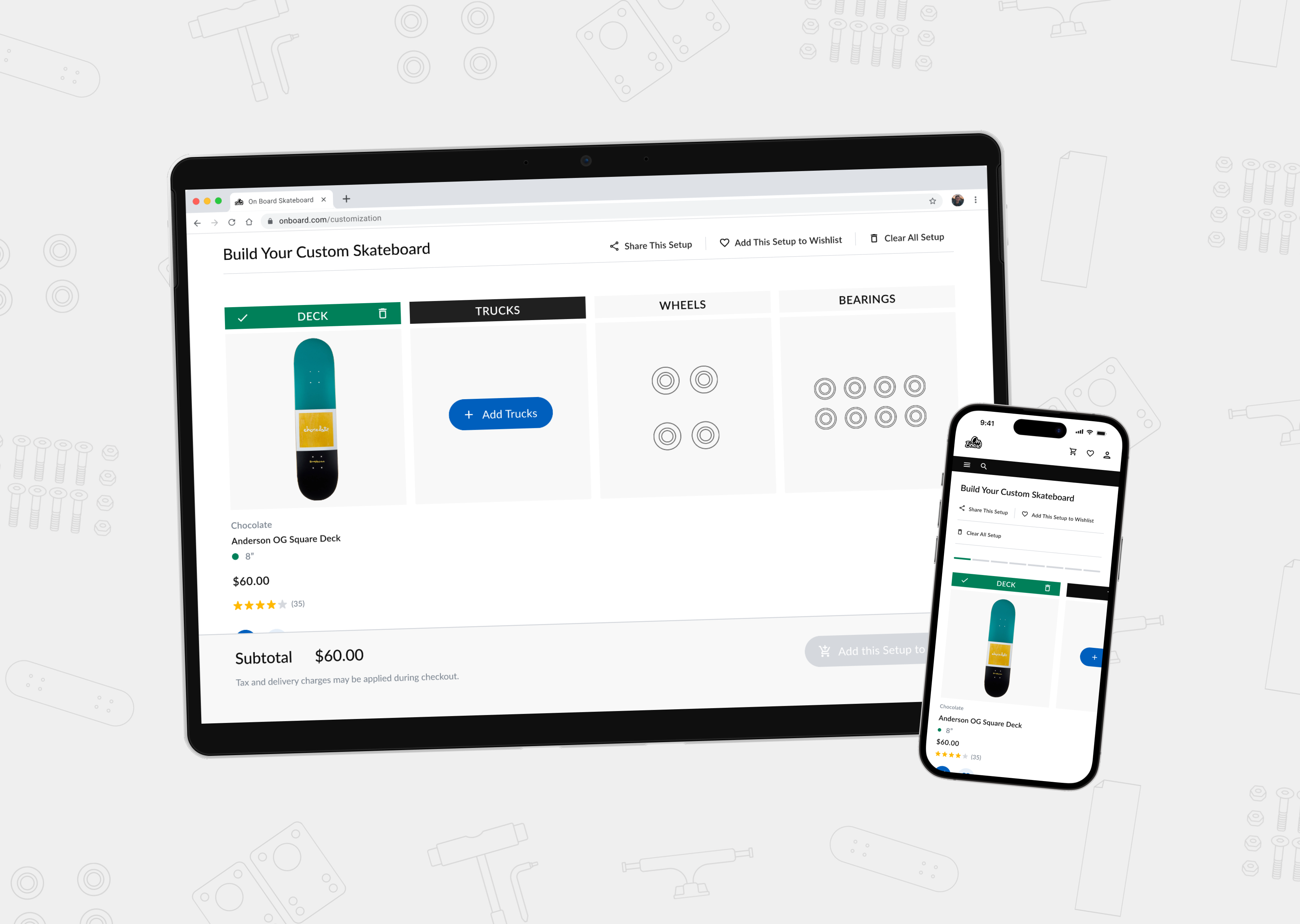
Most sites use a manual, part-by-part selection process. While this may benefit advanced users, it often causes confusion for beginners, who lack the knowledge to confidently choose compatible components.

Design & Ideation

💡

Now that we've identified the problem.

How might we design a flow that offers beginners guidance in selecting a skateboard tailored to their specific needs?

While brainstorming the customization flow, I explored various approaches:
Various Comments and Feedback on the Confusion Surrounding Skateboard Selection

Concept A: Psychometric Test Style

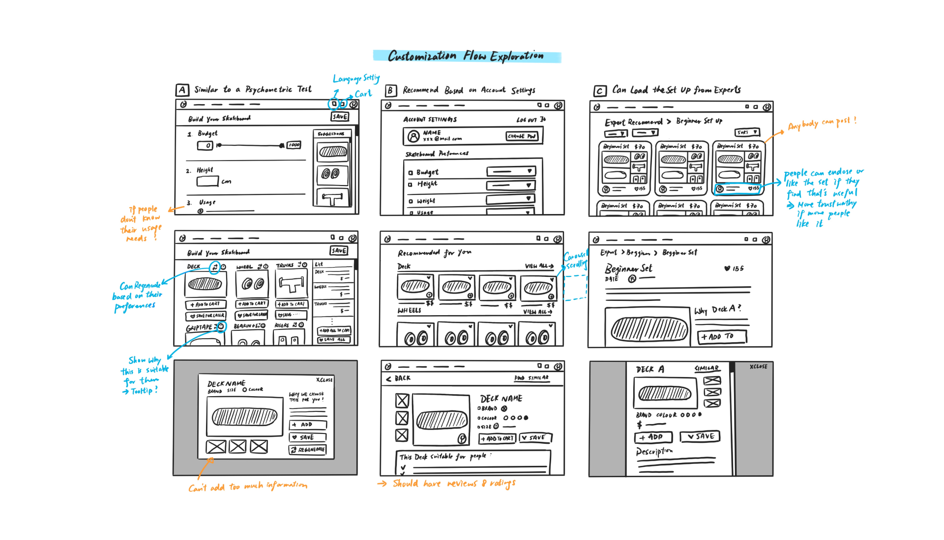
How might we create a skateboard selection experience similar to a personality or MBTI quiz?

Concept B: Account-Based Preferences

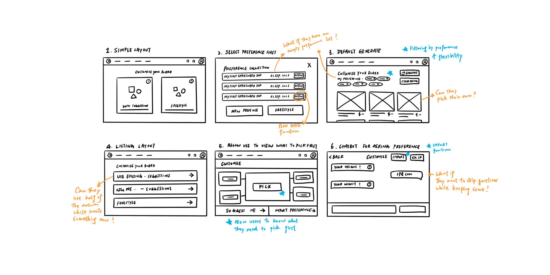
How might we let users set and update their preferences within their account at any time for smarter recommendations?

Concept C: Expert Setups & Community Sharing

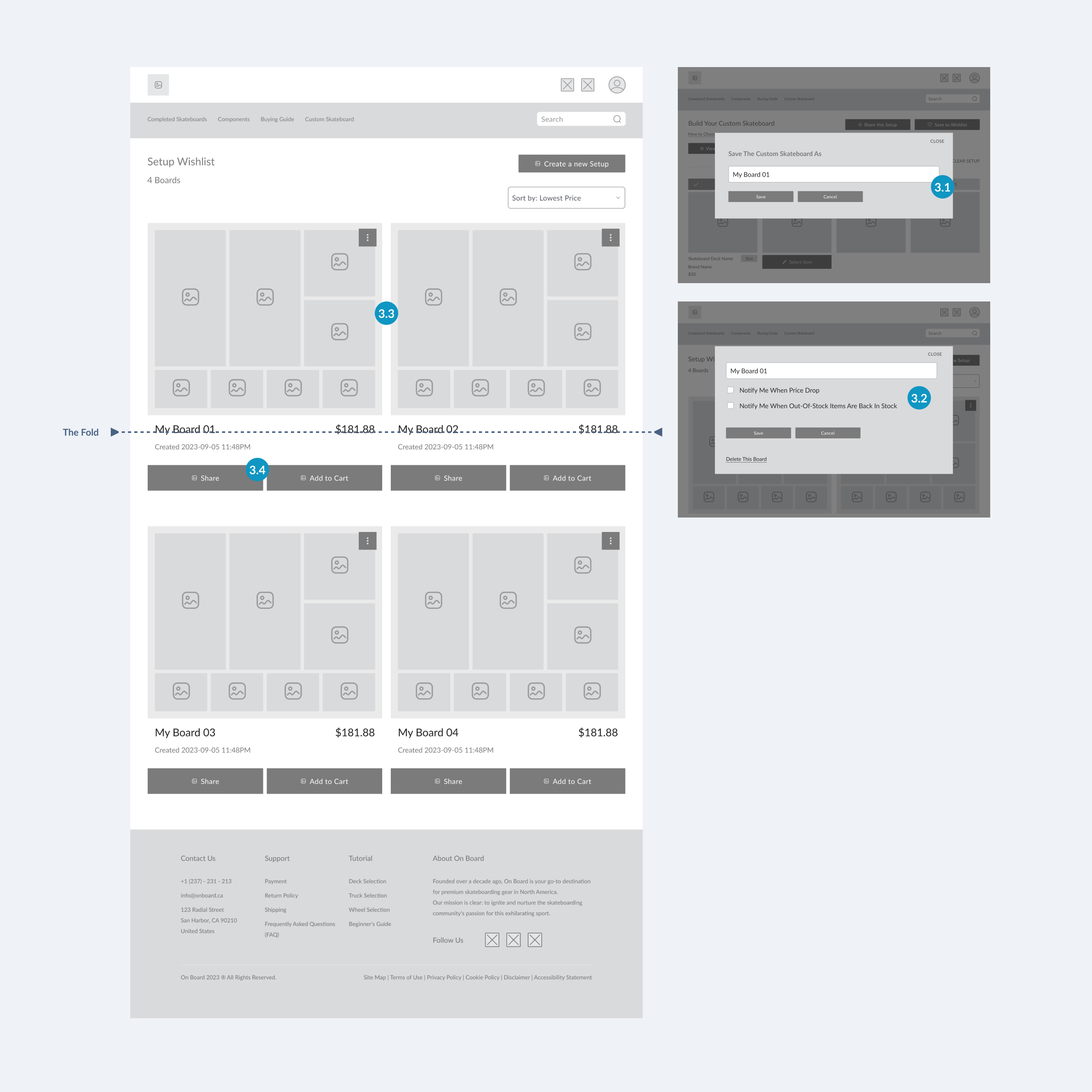
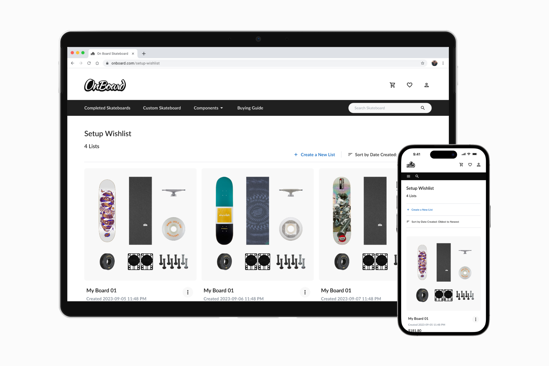
How might we let users save expert-recommended setups, share their own, and get feedback or endorsements from the community?

After evaluating the concepts, I considered implementing a questionnaire-based suggestion system.
Various Comments and Feedback on the Confusion Surrounding Skateboard Selection
Users could save various preference sets, allowing them to quickly access results if their preferences remained unchanged from the last time.

However, they would also retain the option to conduct a fresh preference test with each purchase.

Additionally, we could introduce a rating system for each item to indicate user preferences and reveal which items are commonly paired, such as item A being frequently purchased with item B.
How (I thought) users would navigate?
I initially explored the idea of incorporating an automatic suggestion system to enhance user convenience.

The concept involved users inputting their preferences, including budget, skate location, and design preferences, and the system would generate a customized setup list for them.

The goal was to streamline the shopping process, allowing users to proceed to checkout effortlessly.

💡

However, following usability testing, users did not adopt this concept. So, how do users actually navigate?

Users benefit from receiving guidance on their choices rather than being presented with pre-made selections.

Wireframe
My First Iteration.
When I embarked on the initial wireframe design and conducted usability tests, my primary focus was on three distinct user processes:
Checkout Process
Despite the availability of established checkout solutions like Stripe, this project required the creation of a checkout process.

I drew inspiration from various checkout experiences to ensure technical feasibility and align with familiar user patterns found on other websites, delivering a user-friendly experience.
As mentioned earlier, users weren’t convinced by this concept.
What specific usability test findings pointed to the need for change?

🗨️

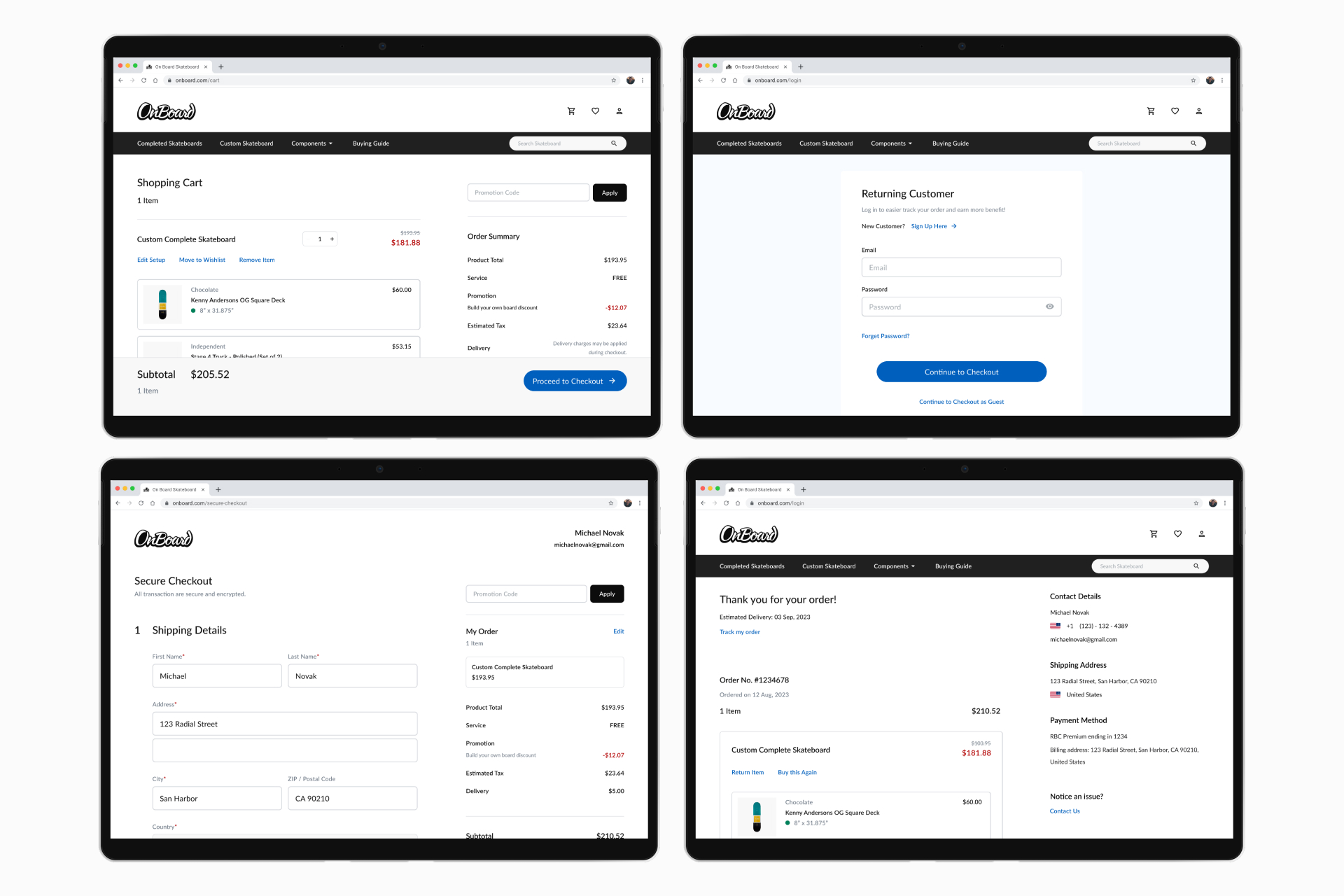
"I get a little worried that changing one thing might mess up my whole list. If it suddenly disappeared without warning, I'd probably hesitate to complete my purchase. I spend a lot of time on it, and it would be frustrating to see it gone."

- Douglas / Usability Test Participant

Priority #1
Potential Item Removal Warning
Beginners felt frustrated when changing the deck size caused the trucks and grip tape to disappear. Many didn’t realize these parts depended on deck width, making this a common issue and a top priority to improve.
Priority #2
Clarity in Questionnaire Guidance
Users found questions like “Where to skate?” too limiting. They wanted to select multiple answers and needed clearer budget guidance due to limited knowledge.
Priority #3
Preference and Setup Sharing
Some users wanted to share their setups for advice, others wanted community recommendations. Both were frustrated by the lack of an easy sharing feature.
Priority #4
Enhancing Review Information
Users wanted to see full review details, including 1-star ratings, reasons, star breakdowns, and real-user photos especially for judging graphics.
So what alterations did I make after the usability test?
1. Step-by-Step Process for Enhanced Navigation
1.1 Overlay pop-Up for potential item removal alert
1.2 Utilize suggestions instead of generating an items list
1.3 Step-by-step process guidance for user-friendly navigation
1.4 Replace dropdown with radio buttons for enhanced clarity
2. Improved Questionnaire Guidance: Offering References for User Assistance
2.1 Offer budget references
2.2 Enable users to select "I don't know" for uncertain answers
2.3 Provide unit selection for familiar shoe size conversion
2.4 Implement checkboxes for multi-option selection
2.5 Offer guidance on the impacts and differences related to this option
3. Enhanced Setup Saving and Sharing: Facilitating Sharing and Comparison
3.1 Users can rename and save setup lists at any time
3.2 Users can enable notifications for price drops and restocked items in their saved lists
3.3 Users get a quick overview of each board for easy comparison of look and price differences
3.4 Users can share saved boards from their wish list with others
4. Comprehensive Review Details: In-Depth Information
4.1 Offer an overview of review ratings, showing the number of ratings for each star, with detailed views accessible by clicking on each star
4.2 Enable users to exclusively view photo comments
Design System
Color Awareness
Color is strategically used to indicate various actions, step states, and user choices, enhancing usability.

I established a color and typography library within my Figma design file to maintain overall design consistency.
Minimalistic Approach
To emphasize the skateboard graphics, I adopted a minimalist UI style, allowing users' eyes to remain fixed on the skateboard designs and informations.

I utilized Figma's components function to establish a versatile sticker sheet, enabling efficient and consistent work by customizing various properties.
12-Column Layout
I implemented a 12-column layout in the design to facilitate responsiveness and ensure uniform alignment across all pages.

I employed Figma's layout grid function to ensure consistent layout throughout my work.
Final Solution
A step-by-step customization guide with suggestions to provide a user-friendly approach for beginners to create their first skateboard.
3. Simplified Setup Wishlist Comparison
To assist users who may have difficulty deciding or want to save for later, a visual collection of skateboard setups with images allows for easy comparison.

Users can effortlessly review their saved setups, comparing prices and details.
4. Flexible Notification Options
To address potential out-of-stock situations and accommodate users waiting for price drops, the "Notify me if price drops" and "Notify me upon restocking" features offer easy wishlist management, sparing users from daily checks.
5.  Step-by-step checkout process
While there are several checkout services available for websites, such as Stripe, Square and PayPal, I've created a streamlined checkout flow for On Board as part of the project's requirements.

This checkout process is designed to enhance the overall customer experience, making it more seamless and user-friendly.
Reflection
❌ Avoid Making Assumptions!!
One major lesson I learned: never assume.
As a beginner, I thought users wanted automatic skateboard suggestions—something I had wished for.
But after interviews and research, I realized this didn’t reflect what users actually needed. If I could start over, I’d focus more on discovery and less on assumptions.
📝 Include Diverse User Testing
Most of my testing was with beginners, due to my limited network.
Looking back, involving experienced skaters could’ve uncovered different pain points.
In future projects, I’d prioritize more diverse user input for a fuller perspective.
🛹 Definitely skateboard knowledge!
As a newcomer, this project taught me a lot. I now feel confident choosing a setup that fits my needs and excited to apply that knowledge moving forward.
Go to the top