Back
Sushiro, a restaurant I truly appreciate, is renowned for its extended wait times, frequently exceeding an hour for a table.
My role involved examining the restaurant's expansion into Toronto and devising a solution to address this issue by developing a reservation app for customers.
This design process encapsulates the stages I've navigated through during this project.
Iterating between Design Exploration and Prototyping & Testing as necessary, I've supplemented my progress with further research whenever questions arose during the design phase.
This initial phase involves understanding the problem, empathizing with users, mapping user journeys, and conducting competitive audits, white paper research, and user interviews to grasp the problem's essence.
After identifying gaps and user needs, I brainstorm solutions, define product requirements, and formulate How Might We questions to shape the app's features and functionality.
Here, I translate concepts into wireframes, experimenting with various design possibilities to visualize potential outcomes.
I create prototypes from my wireframes and test them with users. This phase uncovers user struggles, strengths, and weaknesses, leading to further iterations or design refinements.
High-fidelity designs are developed, refining layouts, elements, and overall aesthetics. Design adjustments are made, and the final design is polished. This phase concludes with documenting the design process and composing this comprehensive case study.
Since this is a personal project aligned with a certificate requirement, it doesn't include a hands-off and validation phase.
I'm excited for an opportunity to develop a project that enables me to launch a product and validate it in the market.
🗨️
"Sushiro brought back an item I wanted to try, but when I arrived after work, the walk-in line was closed. Thanks to a friend, I got a ticket, but by the time I reached the restaurant, the item was sold out😟"
Sushiro Customer Review @ Tripadvisor.com
Sushiro needs a reservation app for several reasons:
1. Customer Inconvenience
2. Difficulty for Large Groups
3. Limited Customer Engagement
Ultimately, this situation leads to missed business opportunities.
Potential customers who prioritize efficient dining experiences and wish to avoid long queues are likely to be discouraged, resulting in lost revenue for the restaurant.
Our project's purpose revolves around the management team at Sushiro, while our target audience encompasses the customers.

Address a customer-centric problem by introducing online reservations, which eliminate the need for long queues.

Boost revenue, nurture customer loyalty, and elevate overall satisfaction.
In essence, our goal is to create an appointment app that streamlines reservation processes, offering customers effortless booking and the ability to avoid lengthy queues.
We will measure its success by monitoring the percentage of app users who return to the restaurant for additional reservations, indicating the app's impact on cultivating customer loyalty.
While this approach may speed up the process and meet short-term needs, the app lacks user-friendliness and doesn’t encourage long-term engagement.
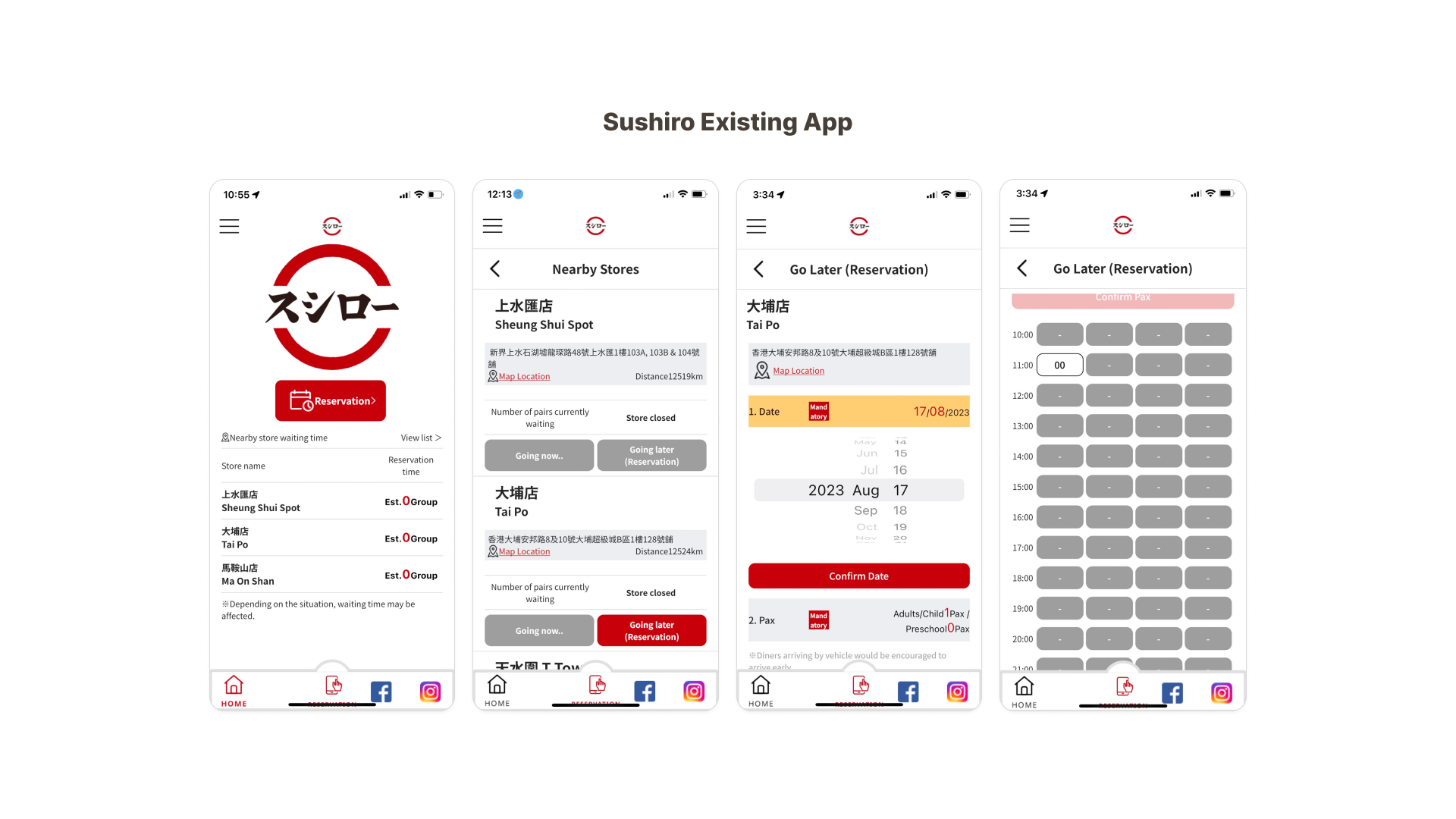
While direct replication isn’t ideal, we can draw valuable insights from the similar app used overseas.
Variations in fonts, spacing, colors, and layout create confusion and make navigation harder for users.
Multiple buttons leading to the same screen clutter the interface and confuse users—for example, four separate buttons all linking to the same shop list.
If a preferred time is unavailable, users must check each day manually. The app doesn’t offer smarter alternatives, making the booking process frustrating and inefficient.
I noticed clear cultural differences between Canada and Hong Kong, prompting me to explore white papers and research studies for deeper insights.
💡
Hong Kong exhibits a higher dining frequency compared to Toronto.
According to Rakuten Insight and Statistics Canada, 87% of Hong Kong residents dine out at least once a week or more, in contrast to 54% of Canadians.
💡
In Hong Kong's densely populated environment, reservations are commonplace due to high demand and limited seating, especially at popular eateries.
This led me to consider the integration of a loyalty points system for reservations.
Such a system could encourage Canadian users to make reservations through the app, paralleling Hong Kong's dining culture.
To understand better of individuals' reservation behaviors and perceptions of the booking process, I conducted interviews with a diverse group of 7 users aged 25 to 65.
This range encompassed varying dining preferences and levels of familiarity with Sushiro.
🎙️
- How often do you dine out at restaurants?
- Do you typically make reservations in advance?
- Can you describe a recent experience you had while making a restaurant reservation?
- What factors influence your decision to choose one restaurant over another?
- How does the reservation process play a role in your decision?
- Can you describe a situation where you had to modify or cancel a restaurant reservation?
From the interviews I conducted, three key themes emerged as significant insights.

All interviewees stated that they prefer to make reservations when dining out with others, particularly in larger groups.

The majority of interviewees emphasized the need to make reservations on special occasions like Valentine's Day, Christmas, and birthdays.

A significant number of interviewees highlighted their reliance on others' recommendations and restaurant ratings before finalizing their reservation decisions.

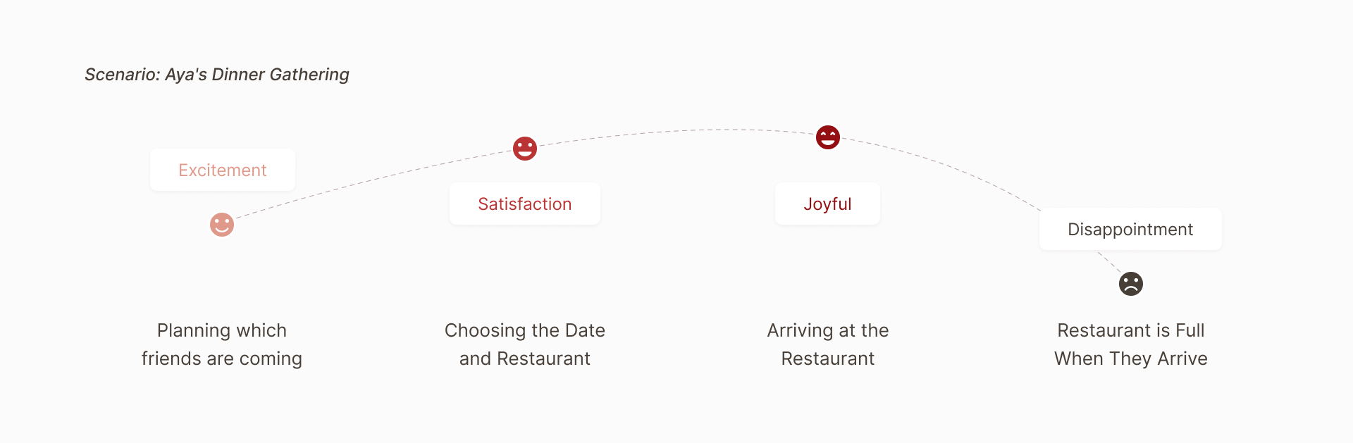
“A table filled with friends, laughter, and sushi – that's the recipe for an unforgettable night.”
Aya's passion for food is only rivaled by her desire to create lasting memories.
She often dines out twice a week, either with her partner for intimate evenings or with a group of lively friends.
As someone who enjoys the company of others, she often organizes dinners with friends.
During the brainstorming phase, I worked on creating various ideas to achieve the project goals.
The ultimate objective is to enhance customer satisfaction by minimizing long waiting times and preventing potential customer loss.
Despite its welcoming appeal, this AI chatbot concept demands substantial resources and costs. It exceeds our project scope.
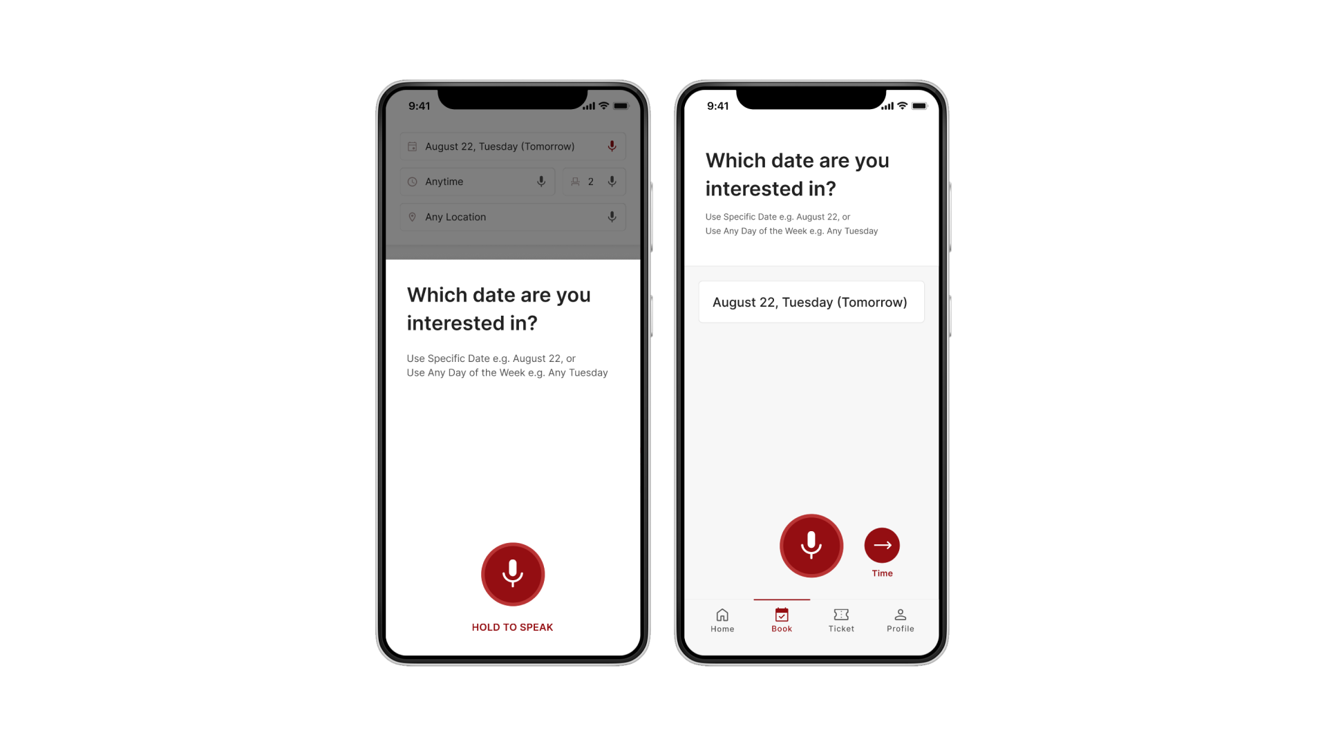
How about we introduce a voice accessibility feature to aid users less familiar with app usage, ensuring easy booking for everyone?
While games could ease wait times, they divert from our app's core purpose. Our focus is simplifying reservations, not providing gaming distractions.
How about we implement a virtual queueing system that aligns better with our core purpose?
Core functionality of the app, making booking hassle-free.
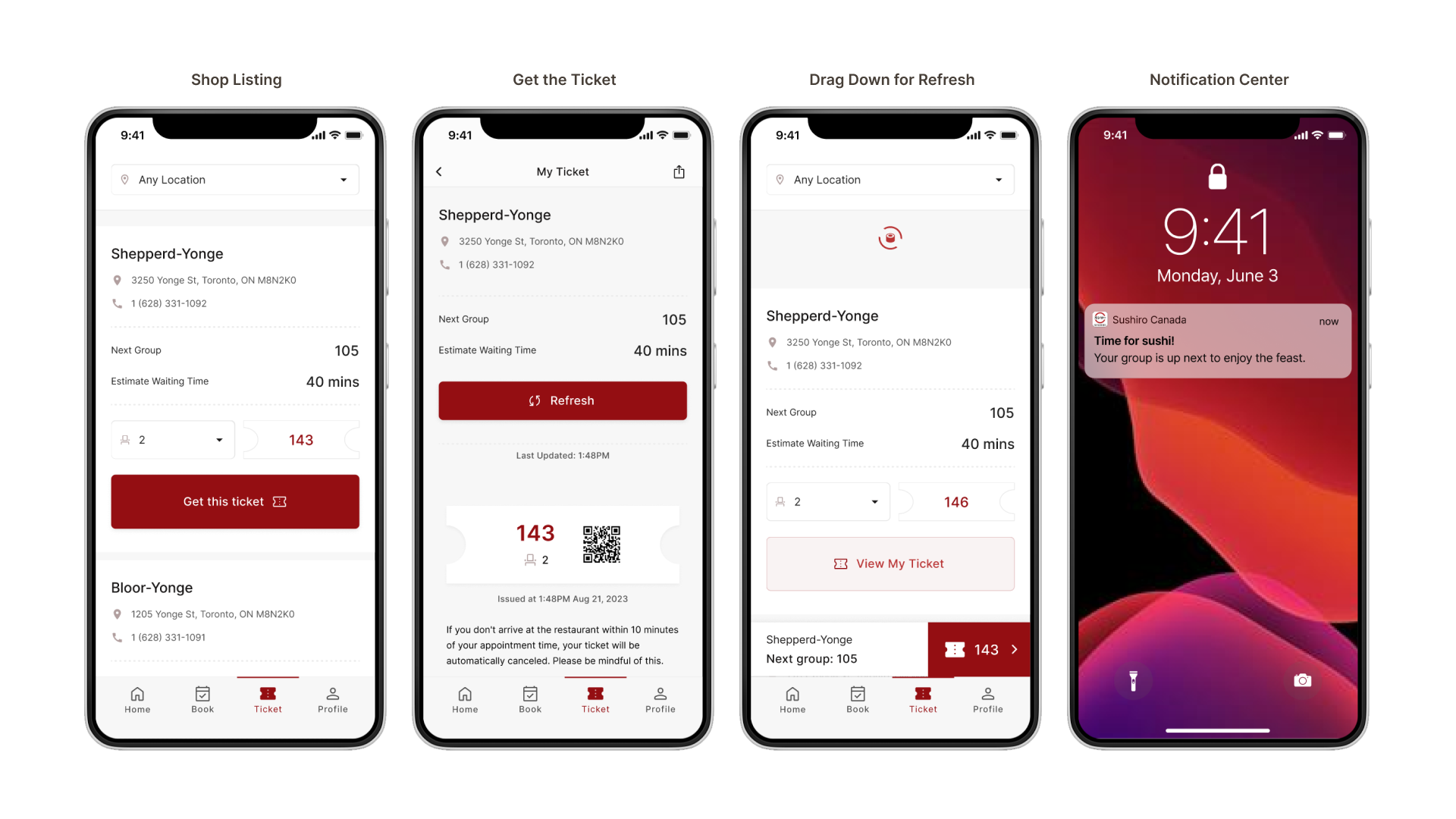
Provide customers with digital tickets instead of physical waiting in line.
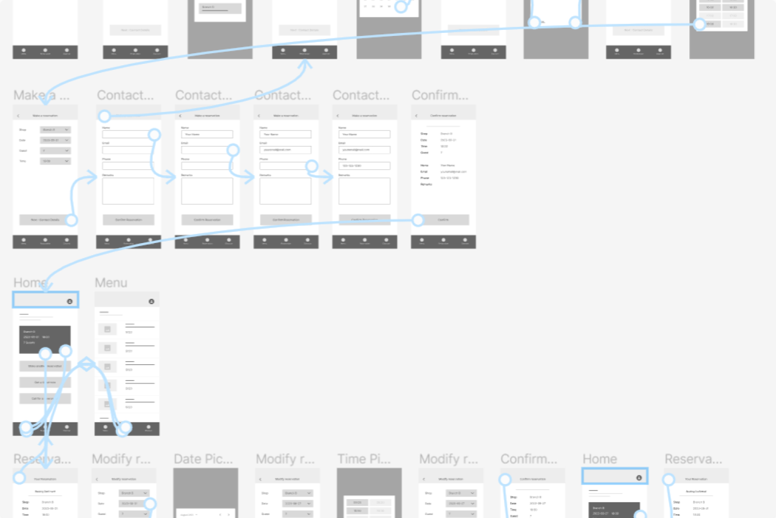
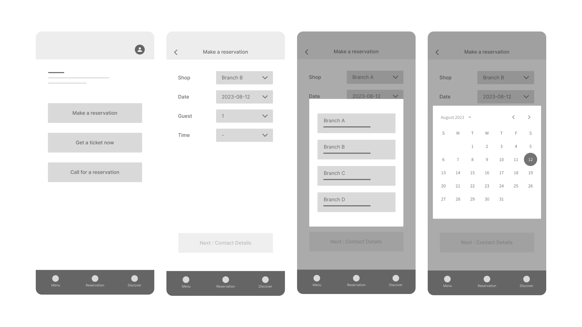
In my initial wireframe design, I aimed for utmost simplicity with just three primary buttons: "Reservation," "Get a Ticket," and a shortcut for calling the restaurant.
I prioritized a clear and straightforward flow. For dropdown selections, I utilized pop-up screens to guide users through the required choices.
Once all selections are made, the booking process is completed.

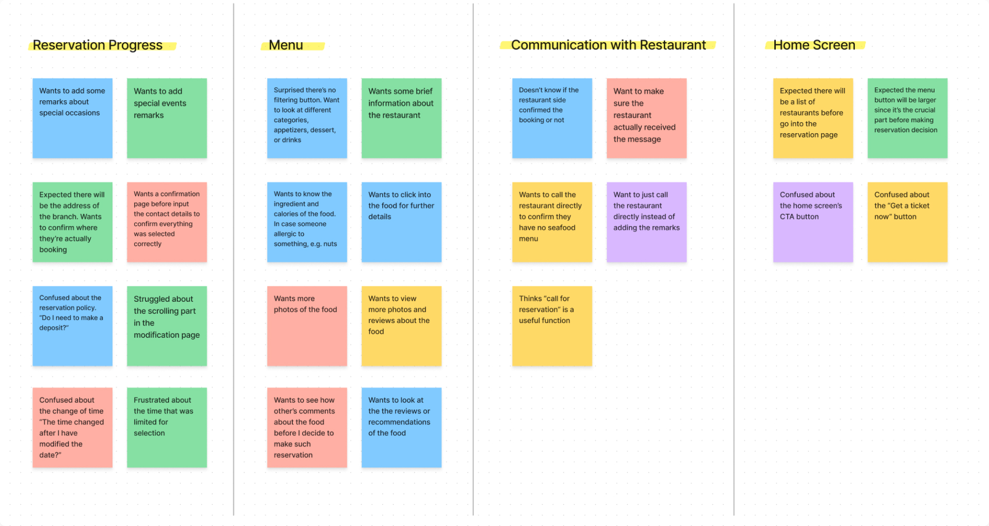
I've conducted 7 unmoderated usability tests with participants ranging from 25 to 65 years old, encompassing various dining preferences.
Testers were tasked with completing 5 tasks:
Book a Reservation, Confirm the Reservation, Explore the Menu, Modify the Reservation, and Add Remarks.
Following the usability test, it became clear that users sought more than just a "simple" app, they desired an application that was both easy to use and fulfilled their requirements comprehensively.
Taking into account the feedback and comments gathered from users, I undertook significant enhancements.
These improvements were guided by four key insight themes that emerged from the usability test, helping me pinpoint the areas requiring focused improvements.
💡
Users often struggle to differentiate the three buttons due to their identical spacing, scale, and placement
💡
Users seek menu details and reviews, indicating a desire for more comprehensive food information.
💡
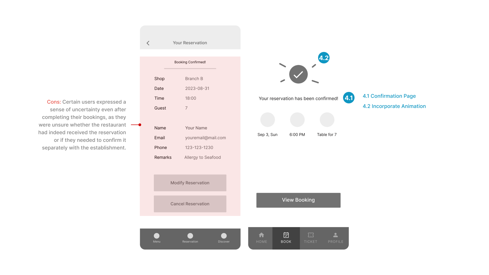
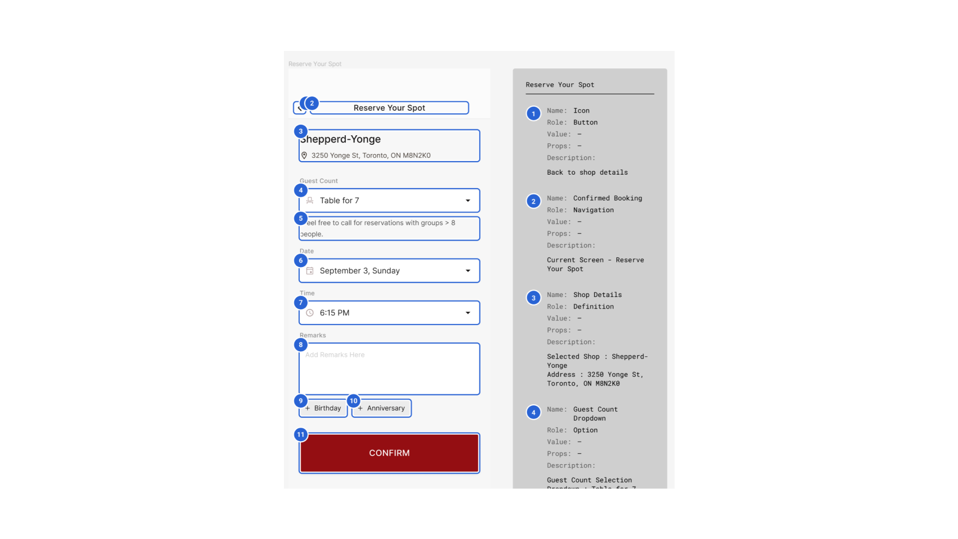
Users experience anxiety over unconfirmed bookings; a dedicated confirmation section would alleviate this concern.
💡
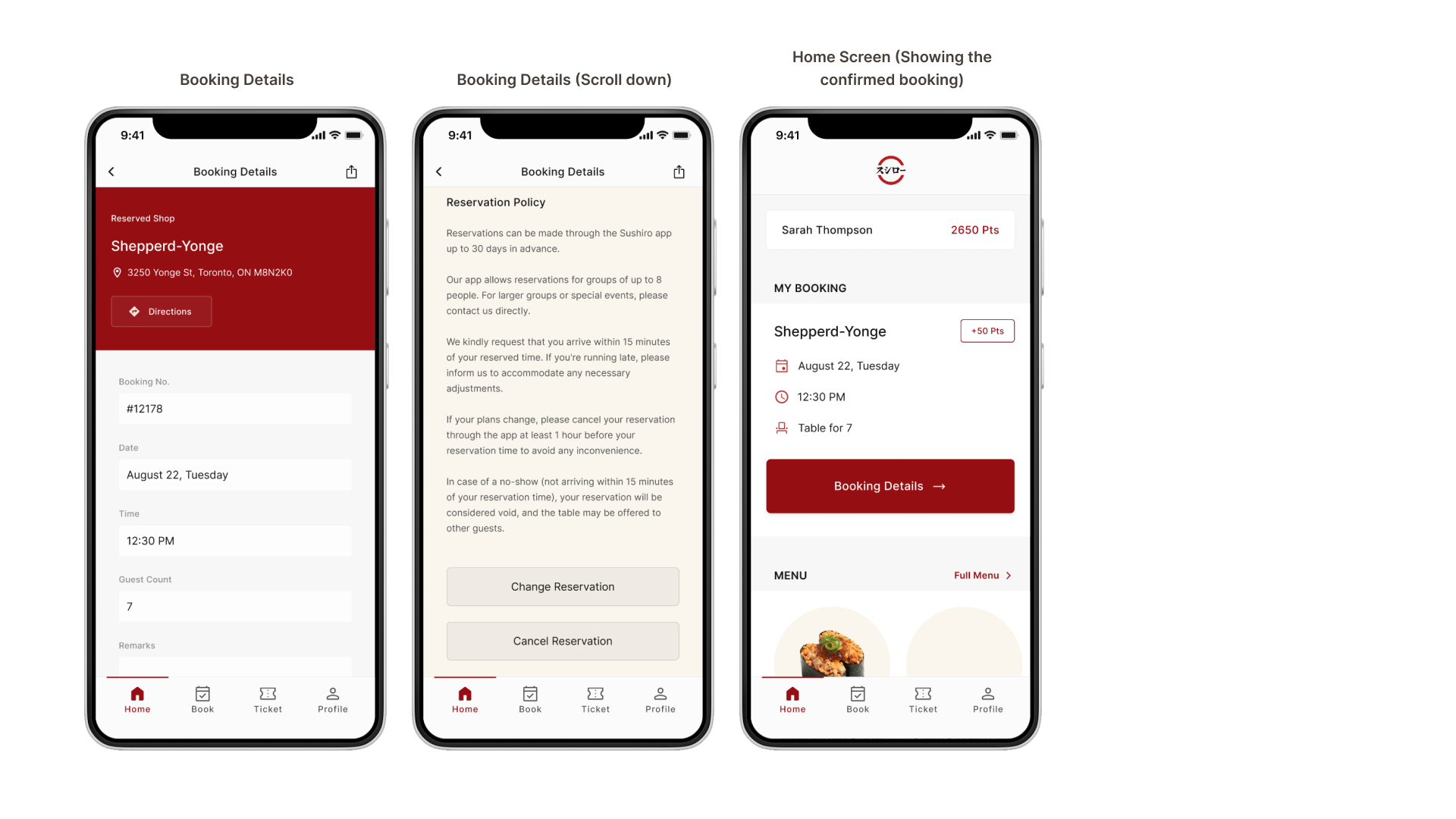
Users want more comprehensive booking details, including branch location and cancellation policy.
Several users have noted that while the overall navigation is relatively straightforward, certain features might require extra time to locate for those who are new to the app.
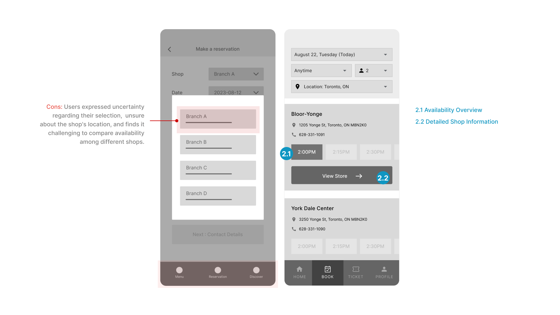
Users face difficulty in assessing a shop's offerings before committing to a reservation, leading to uncertainty about their selection. This prompts users to repeatedly enter and exit the process to verify shop availability.
Users desire access to food reviews, easy categorization (like desserts and drinks), and comprehensive food details.
Users feel uneasy about unconfirmed bookings, a designated confirmation section can address this concern.
🪄
Following the enhancements to the wireframes, I conducted another round of usability testing.
Additionally, I gathered feedback from users after finalizing the design.
Combining their insights with my self-critique, I implemented further design improvements.
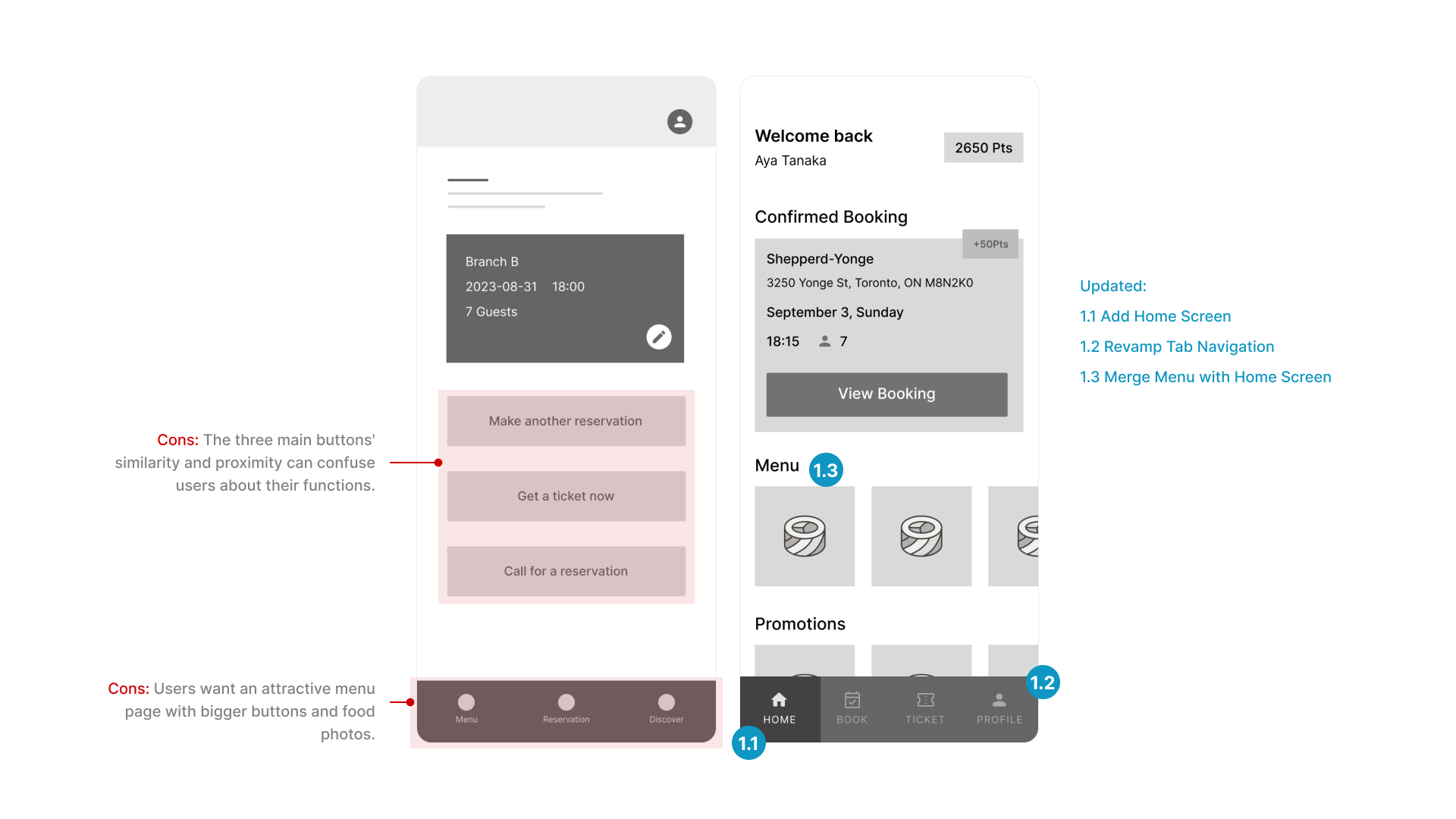
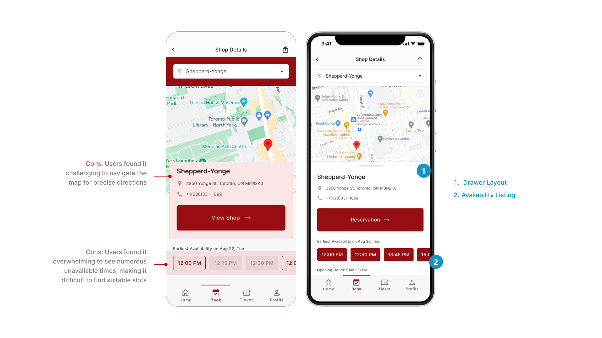
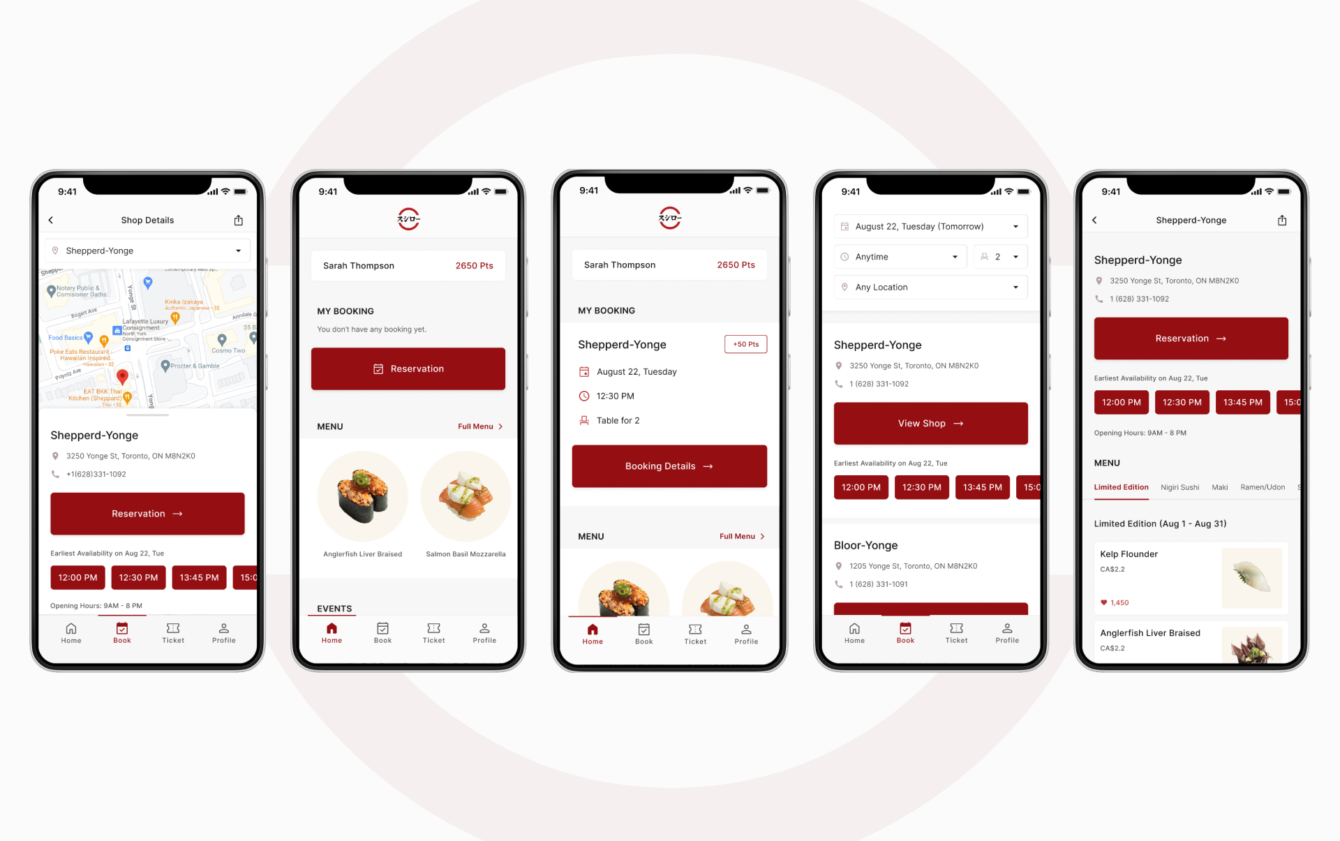
Initially, a card highlighted shop info but hindered map navigation.
So, I switched to a drawer layout. Users can expand the map or shop details as needed.
I showed all timeslots, but users found it overwhelming with unavailable options.
Now, I display only available times in shop info and show the complete list during reservation.
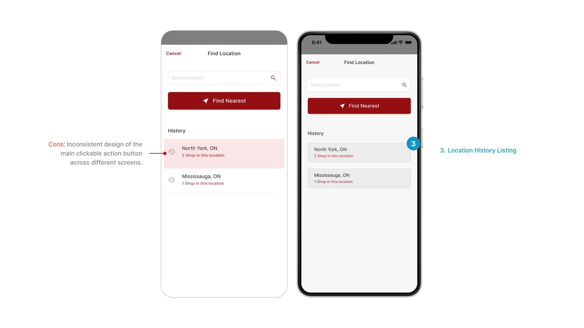
I aimed for a cleaner layout to display the search history for user locations.
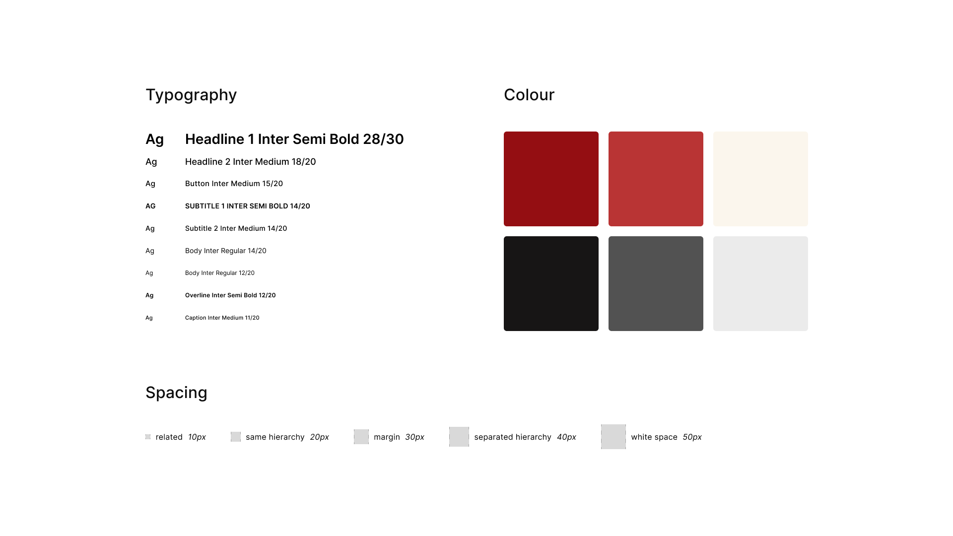
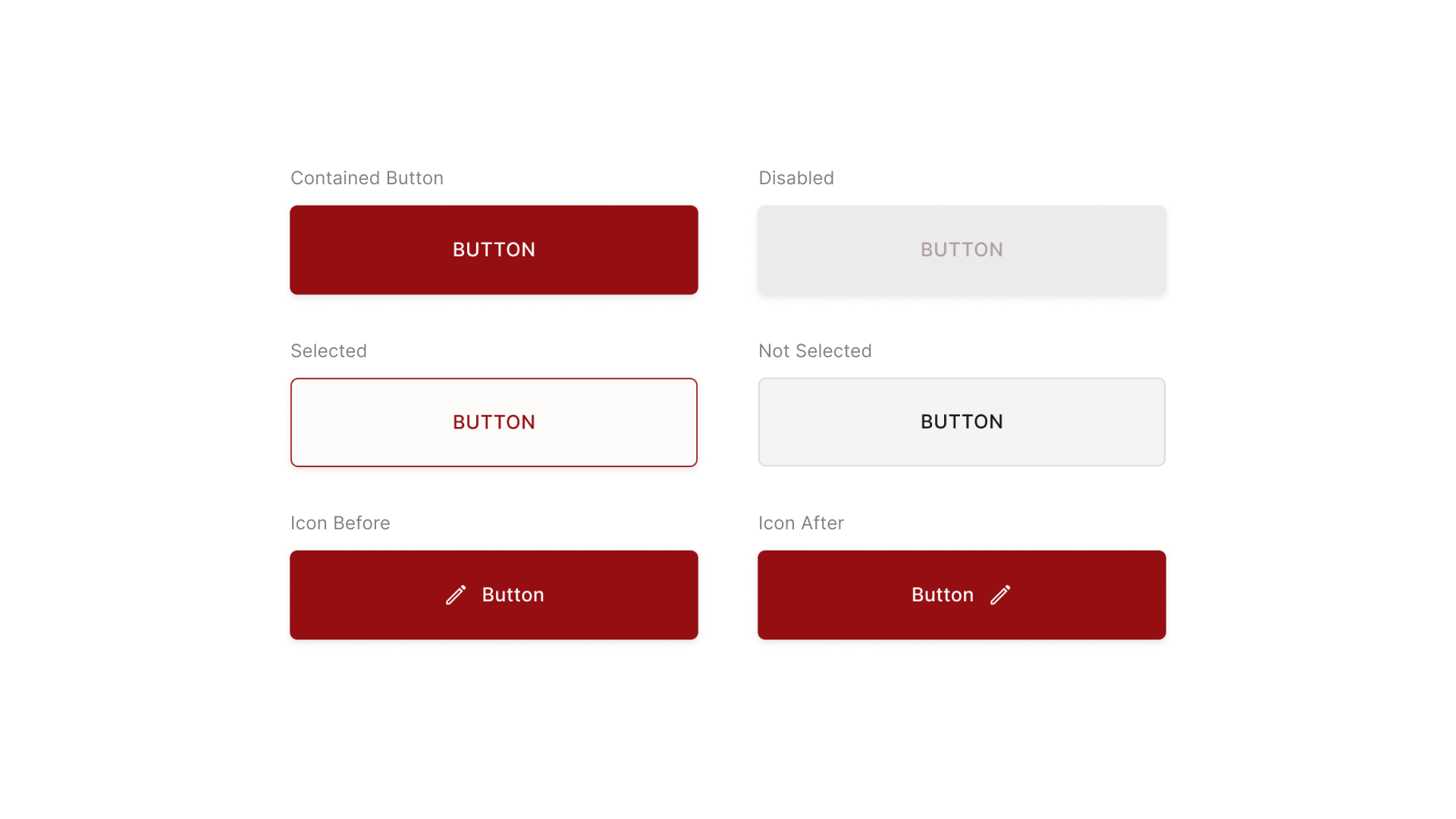
However, upon reviewing all the screens, I decided to maintain a consistent design for buttons.
They are uniformly styled as round rectangles to signify their clickable nature, especially for primary actions.

Align design with Sushiro's branding using color and rounded shapes.

Maintain uniform components, typography, and spacing for a streamlined UI.

Employ color and spacing strategically to enhance user navigation.
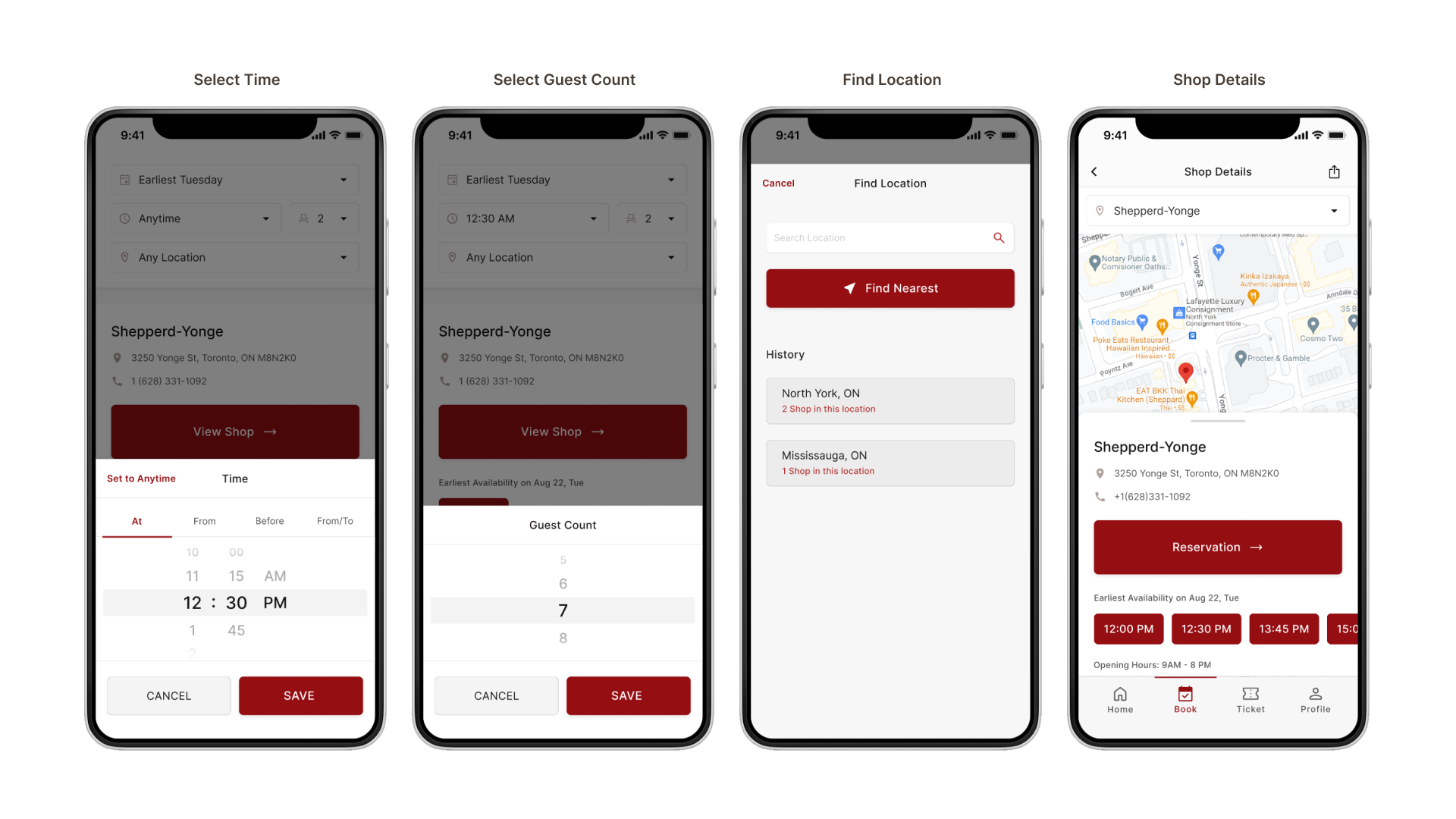
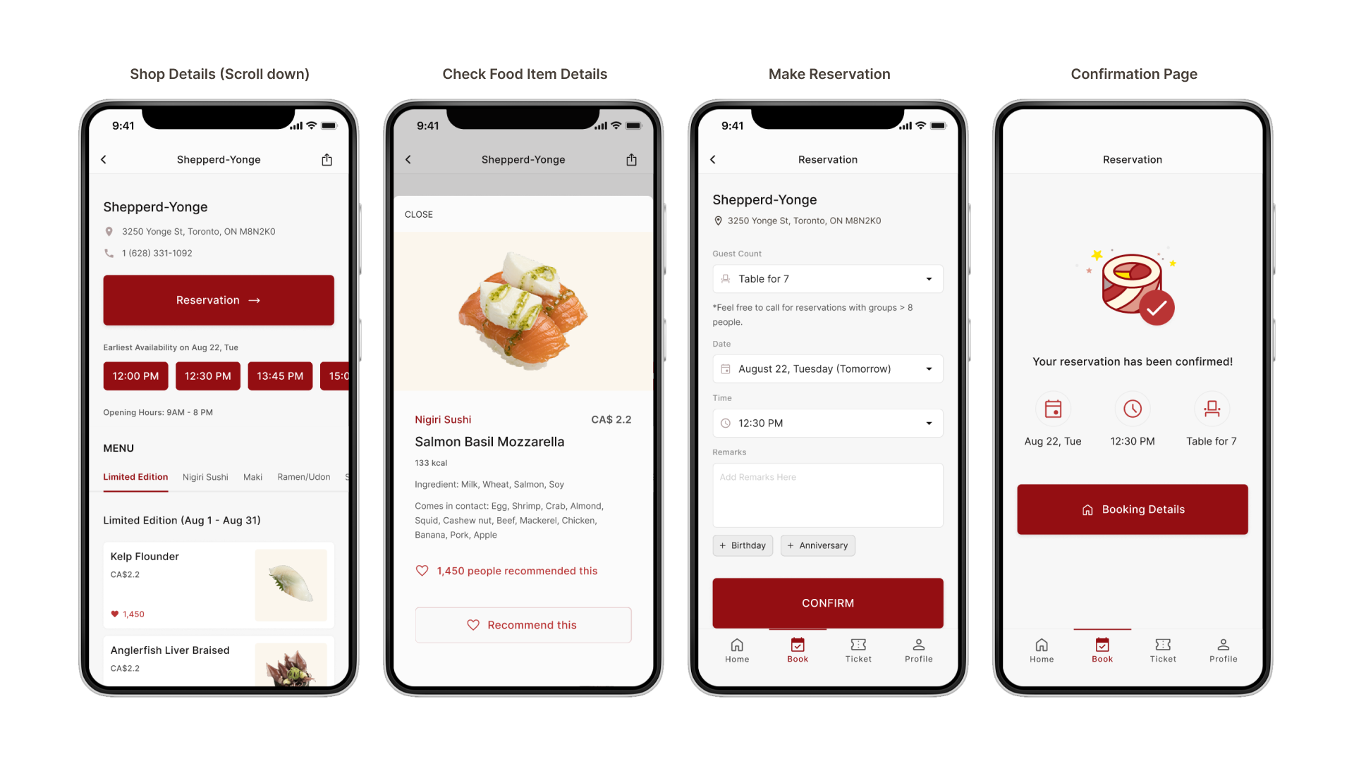
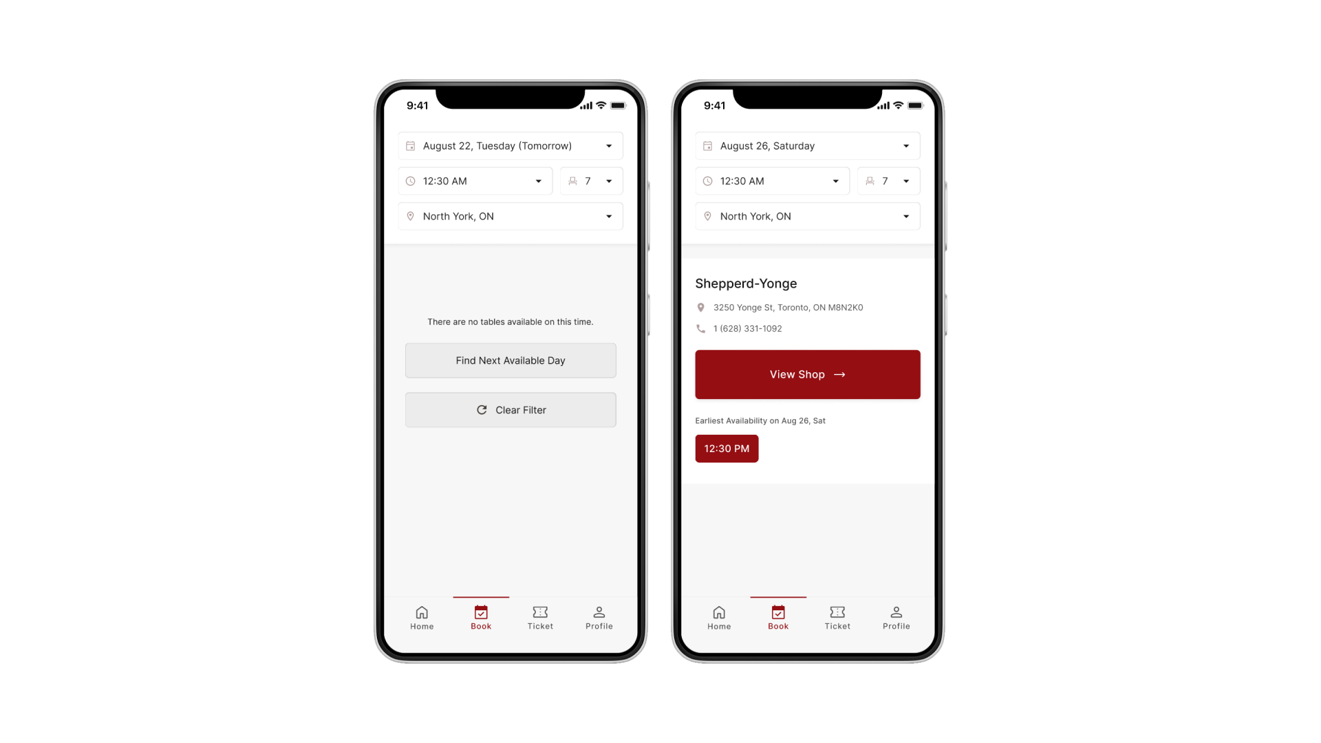
Users can check shop availability with various options like same-day times, preferred weekdays, and location-based choices.
To help users make informed decisions, not only provided shop details like address and directions but also allowed them to preview the menu.
Consistent color and buttons guide users, ensuring a smooth reservation process.
Users can see waiting times for different shops and plan their visit without standing in line.
Users can refresh for updates and receive push notifications when their table is almost ready, eliminating the need to wait at the shop.
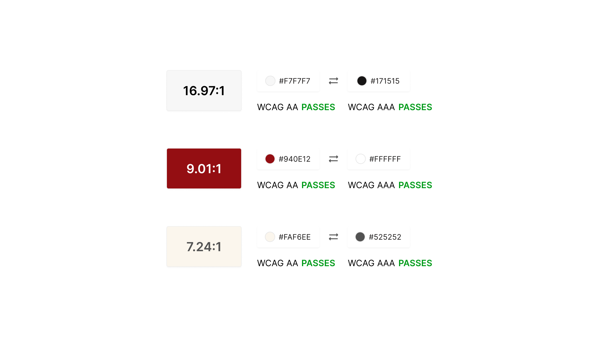
When making color decisions for backgrounds and elements, I always keep in mind the importance of strong color contrast.
This ensures that everyone can easily read and interact with the app's content, making the information more accessible and understandable.
Even though I'm not making an actual app that needs to be built, I'm still designing it by considering the order of importance in the app.
I'm also thinking about how a screen reader would go through it for users who might use it.
This includes deciding what the screen reader would say about each part, so that the app is easy to use for everyone.
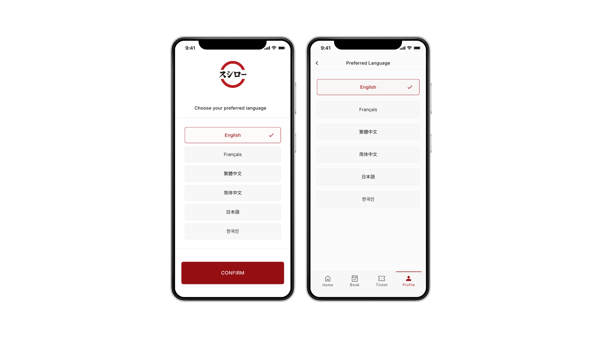
To ensure that people who speak various languages can easily use the app, I believe having language options is crucial.
If the app supports the user's native language, it adopts it. Otherwise, users can pick a language upon app launch.
Users can always change the language in their profile settings.
While I couldn't include this entire feature in the final design due to time constraints, I'm still enthusiastic about the concept.
I envision a voice assistant that simplifies the reservation process for those less familiar with technology, providing step-by-step guidance through audio instructions.
💡
What happens if there's no availability?
If none match, offer the next available day within the same timeslot to provide an alternative.
When customers modify the date, their original timeslot might be taken.
Thus, they'll have the choice to select a new timeslot from a list or maintain their initial preference.
When it comes to interaction design, my aim is to enhance usability through navigational aids that guide users seamlessly through the experience.
Buttons with right-pointing icons signal the reservation flow.
Subsequent pages slide in from the right for consistency, and going back slides the previous page to the right.
Drawers emerge from and retract to the bottom.
This common behavior fosters user familiarity with the app's interface.
All notifications and warning messages will appear as pop-ups with a lively bouncing animation.
This animation is designed to capture users' attention when action is needed.
For instance, when their ticket is next in line or if their chosen time slot isn't available.
Since testers emphasized the significance of a confirmation page for a sense of completion, I aimed to imbue users with the feeling of accomplishment and satisfaction.
To achieve this, I integrated a subtle animation on the confirmation page, enhancing the perception of task fulfillment.
For the refresh functionality, I've chosen the widely used scroll-down method to refresh for the next group and estimated waiting time.
Constantly refreshing the app every second could strain its technical aspects, so I've opted for refreshing every 5 or 10 minutes.
This way, users can also manually refresh whenever they want to check the current status.
With more time, I’d explore how Sushiro apps vary across countries and speak with their teams to learn about local priorities and design choices.
I’m keen to study how people use reservation apps through both surveys and interviews to gain broader, more inclusive insights.
Enable users to register physical tickets in-app and receive live updates to reduce long waits at the shop.
During high-demand periods like holidays, let users join a waitlist. If a spot opens, they get notified instantly.
A simple onboarding screen could help new users understand key app features right away.
Though not implemented, I’d love to explore a voice assistant to improve accessibility and offer hands-free convenience for all users.
Early usability testing revealed gaps between user expectations and actual behavior. Regular testing is key to building an app that truly meets user needs.
Consistent design, flow, and interaction patterns help users navigate with ease. I’ll prioritize this even more in future projects.